
31 Jul
Hale Microsystems, California – Logo Design
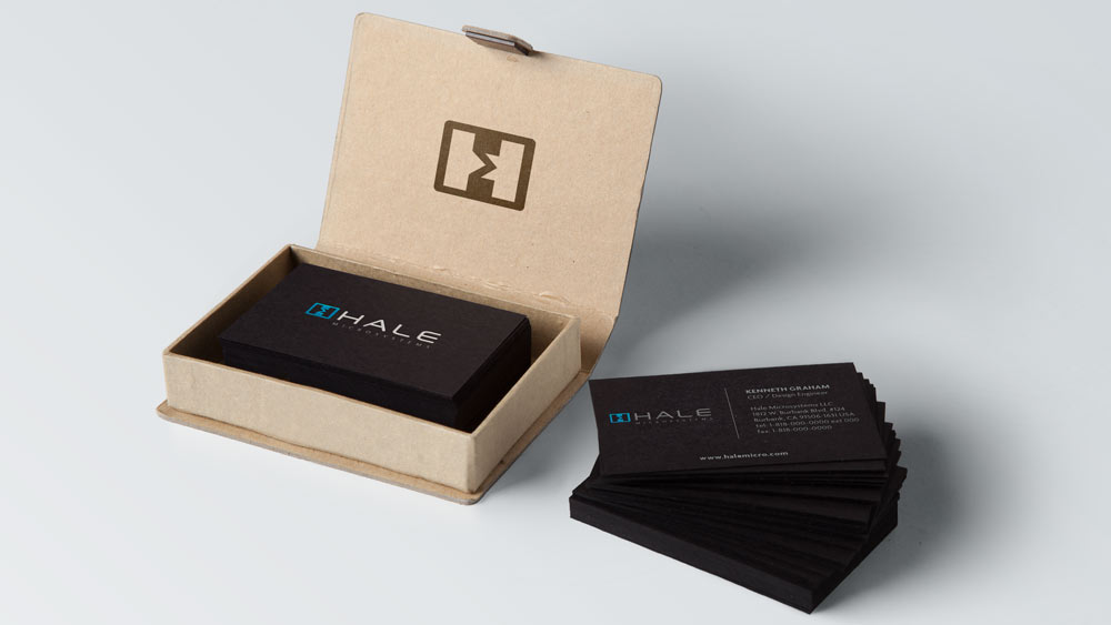
I recently completed a logo design for an electronic design and manufacturing company in the US. Hale Microsystems, California needed a “forward looking” logo to represent their company in all forms of communications (Web, Marketing, Business Cards and Printed Circuit Boards).
The logo itself represents two halfs of the H being connected together but also where the cut is you get an M on it’s side in the negative space.

0 Comments July 31, 2014