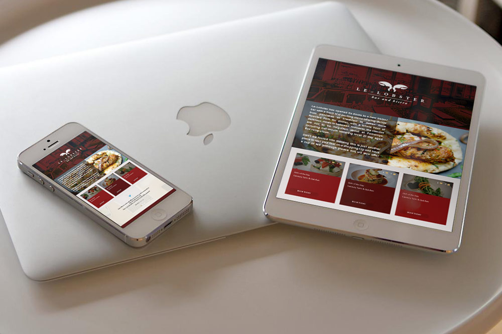
Logo design for a bar and bistro in Liverpool, UK
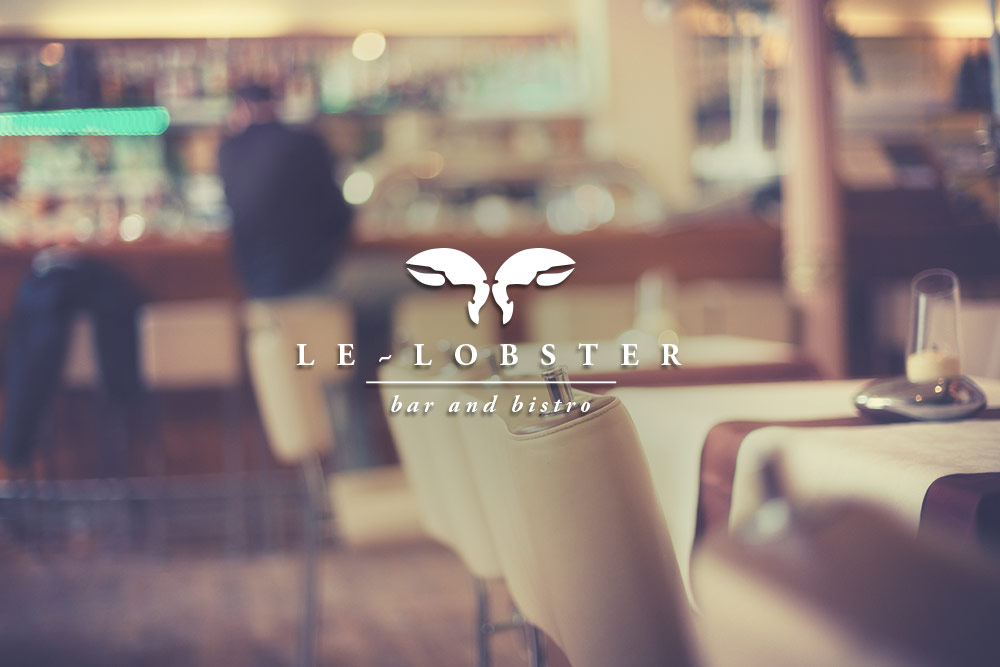
We recently completed a logo design for a new UK Bar called Le-Lobster, it is one of what will become in mid 2009 part of a chain of up-market bars that will be built in many UK cities and towns.

The client wanted a more traditional logo than most new bars but still kept very minimum and classy, this was achieved by using a very simple and easily recognizable icon with a very light serif type to give it a timeless and up-market feel.


October 22nd, 2008 at 12:56 pm
[...] Logo Design Just finished a logo design for a new bar and bistro chain… Full details…. Le-Lobster Bistro, Liverpool - Logo Design | UK Logo Design __________________ Colour Printing and Integrated Cards || Graphic Design, Web Design UK || [...]
November 13th, 2008 at 3:34 pm
I like the logo itself, but couldn’t help wondering whether it would look better upside down, to emulate the t L’s in the name of the bar.
The colour of the logo again could be an issue when it comes to backgrounds. It’s perfect if it always sits on red, but how does it look on white, i.e. on stationary?
November 13th, 2008 at 4:10 pm
Thanks for your concern Rob but as you can see from the link the logo looks just as good in black and white
http://www.logosauce.com/logos/33539
November 13th, 2008 at 4:31 pm
your right, if anything think the black and white gives it a more decadent and upmarket feel.
January 2nd, 2009 at 10:00 pm
It’s very simple but it’s very classy..
ahmetkayafans last blog post..Zulmün Anısına Ahmet Kaya Belgeseli