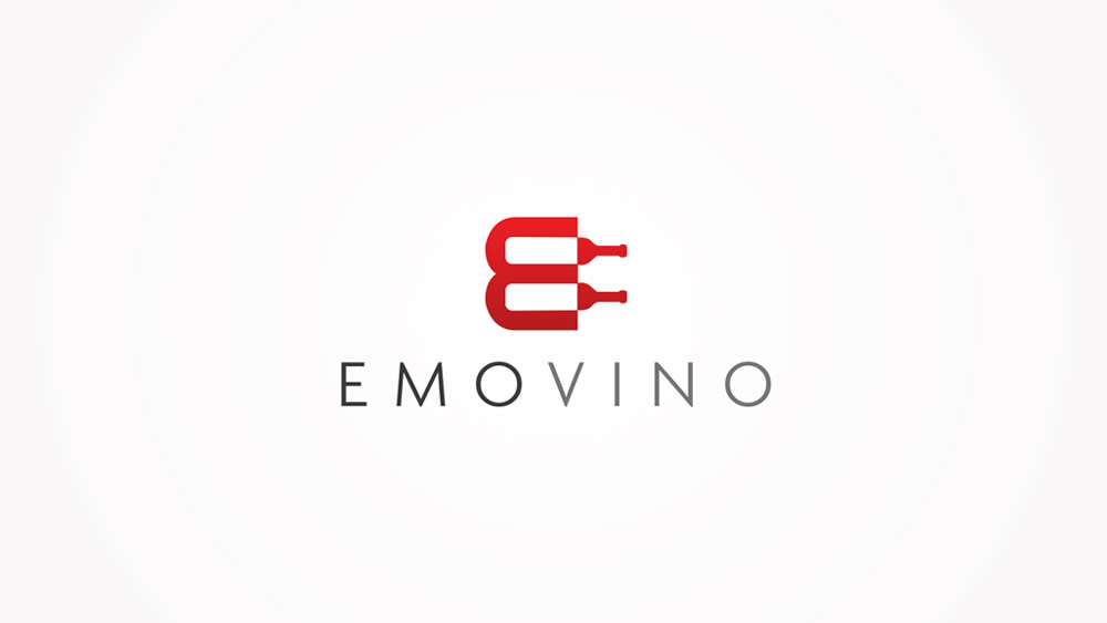
Logo Design for a French Wine Distributor
We were approached to be the logo designer for a Paris based Wine Distributor who delivers French and Italian wines to European restaurants.

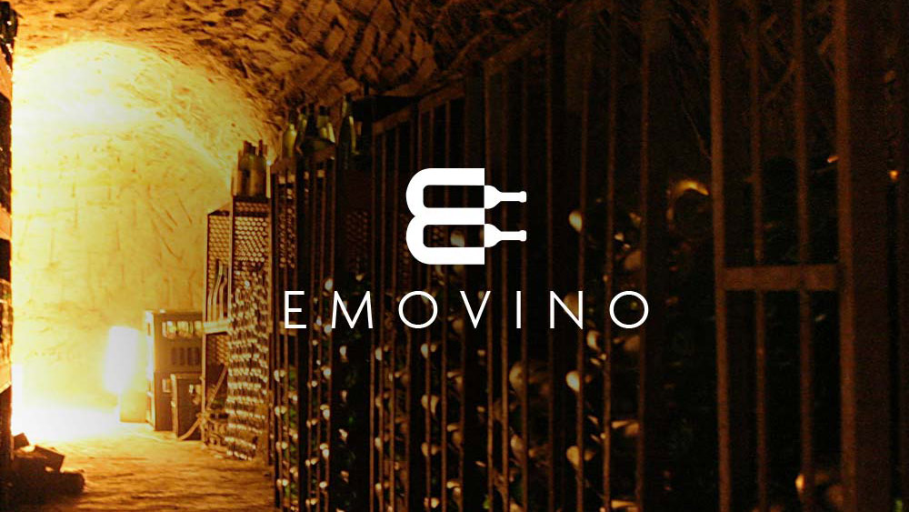
The company have been selling quality premium wines to passionnate people for 12 years, they wanted us to create an unforgettable brand that would reach European customers with strong purchasing power. The name Emovino stands for Emo for emotion and mo for move, we tried to include in the mark the letter E but also the feeling of delivery and also wine storage.
The logo needed to look unique, elegant and luxurious but also simple enough to work in any colour and as a monotone.
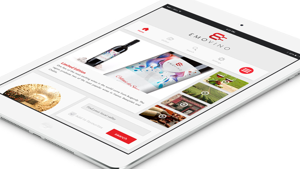
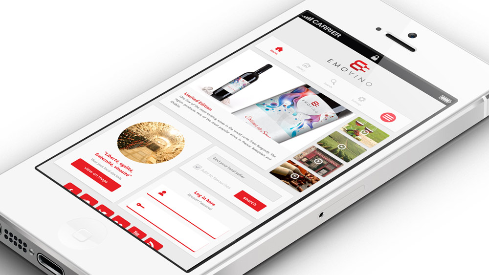
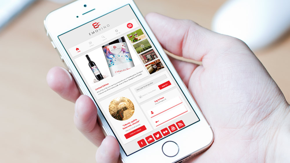
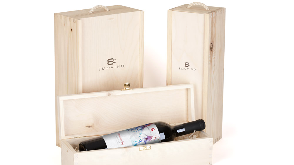
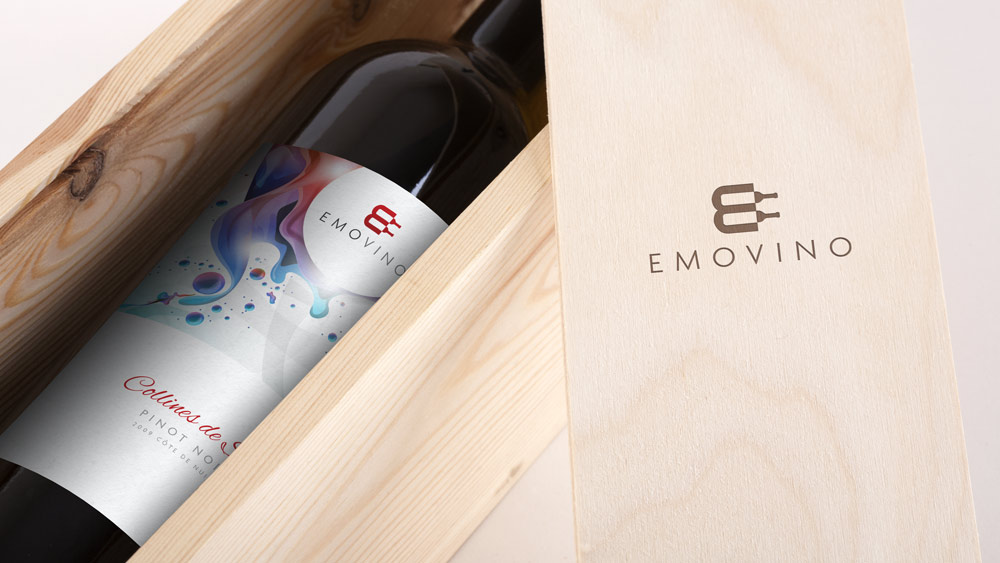
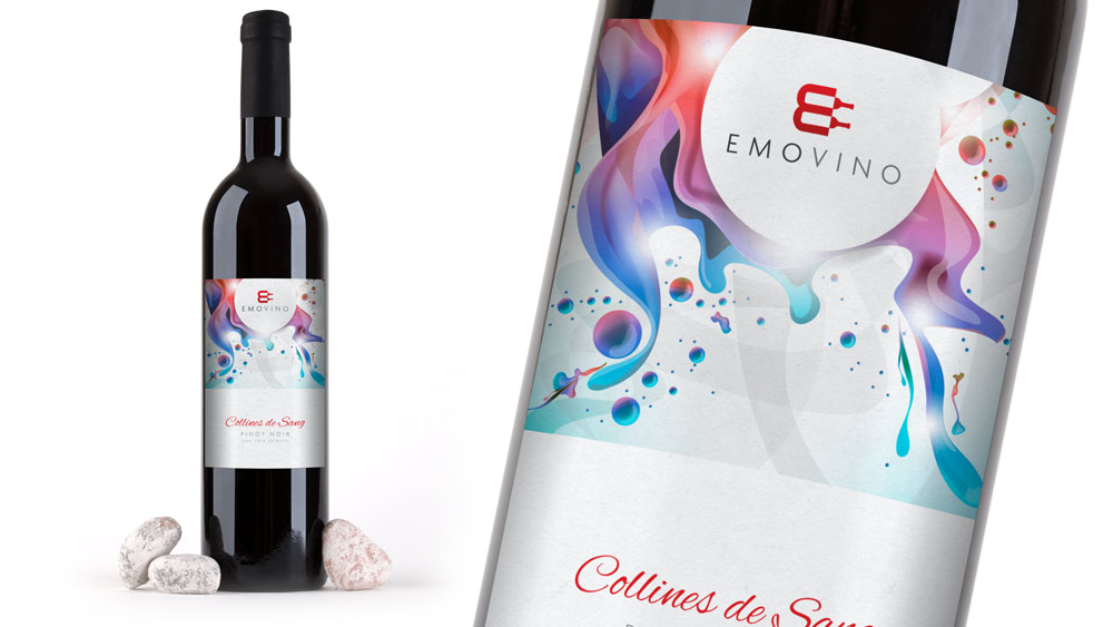
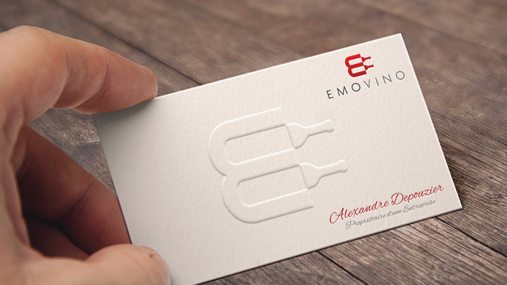
Target market
- European people
- People from 25 to no age limit
- Male and Female
- People with very good income
- Demanding people who love luxury, quality and looking for something unique and different
- Passionate and sensitive people
- People committed to service and the human relationship
To view some more of our most recent work view our full Logo Design Portfolio
Our HP0-Y30 exams provide you 100% pass guarantee.You can get access to 220-702 and 000-978 with multiple prep resources.


January 3, 2009 at 4:50 am
what font is that you used? i like it.
just as a side note, it looks a bit pixelated, idk if it’s just showing weird on the blog.
January 4, 2009 at 8:02 pm
Marc the font is Agenda, the blog does seem to pixelate the images slightly, you can see the full sharp version here
http://www.logodesign-uk.com/wp-content/uploads/2008/09/emo1.jpg
January 8, 2009 at 6:49 pm
dang you toon, i can’t escape you, no matter what i add to my “logo” google search criteria. you’re everywhere dangit!
btw..nice logo.
January 8, 2009 at 7:02 pm
Thanks mate, nice to hear from you
January 14, 2009 at 9:05 pm
Absolutely stunning Toon! In today’s day and age it’s all about branding and creating a presence that is unforgetable. I’ll look into your services when we have our logo redesigned and our website.
January 14, 2009 at 9:09 pm
Thanks for the kind words Frank
February 9, 2009 at 3:42 pm
Great Logo! Having worked in brand marketing for some years I really like this logo. The message is clear, simple and elegant and memorable.
Dan
March 5, 2009 at 6:03 am
That’s a really nice logo. I have to hand it to you, your extremely talented at this. I checked out some of the other logos you have done and really loved them. Keep it up. Cheers
March 6, 2009 at 10:13 am
I like the logo very much! It is simple and minimalistic in design and looks very stylish. The logo looks good now and will look good in the next few years!
Voos Baratos Pariss last blog post..Voos Baratos na Ryanair
March 24, 2009 at 3:10 am
That’s a totally cool logo. Really like the fact that the letter ‘E’ is incorporated to the logo it self with the graphics. Great work. Keep it up. Cheers
April 16, 2009 at 10:49 pm
I am going to have to sign up to receive your feed. This is good stuff
August 8, 2009 at 5:26 am
That’s a really neat log. Man you guys have such creativity. Keep it up guys. You guys rock.
.-= suntouch´s last undefined ..If you register your site for free at =-.
August 21, 2009 at 12:45 am
Good afternoon, wow some excellent drawings, the truth is very talented Congratulations and thanks for sharing.
.-= bajar poker´s last blog ..Un jugador escribe =-.
August 26, 2009 at 10:06 am
That is a very awesome logo design, it visually describes the company and what it very does very effectively. Thank you for sharing this article and ideas with us.
March 24, 2010 at 8:27 pm
Thats a great entry, thanks for writing it. I’ve saved your site and will look forward to reading more!
October 9, 2010 at 5:31 pm
This is a beautiful logo design, congratulations!
July 29, 2011 at 8:12 am
It is very nice logo!